Esports readers move fast. They want a sharp headline, a clear visual hook, a fast path to live context, and enough depth to stay on the page once the first question is answered. A strong feature should feel useful at every scroll speed, whether someone is browsing on a second monitor during a match or reading on a phone between maps.
This sample BO5 feature is built to pressure-test the article design across rich media, structured data, long-form pacing, and quick-reference modules. It mixes editorial storytelling with practical blocks that should still feel clean once the site has real match analysis, rankings stories, and tournament coverage flowing through WordPress.
What the best esports stories deliver first
- A clear point of view so the reader understands why the story matters in one glance.
- A visual rhythm that breaks up dense text with quotes, images, tables, and callouts.
- A live bridge between editorial coverage and BO5 utility pages like matches, odds, and tournament hubs.
- Fast scan paths for mobile users who are not committing to a full read on the first visit.
A feature needs a board, not just a headline
Readers should know where the action is
A well-designed article should not trap the audience in prose. It should keep the main story moving while also pointing toward the live board, the market board, and the relevant match pages. The best editorial layouts make those actions feel native instead of bolted on.
That is especially true in esports, where match context expires quickly and live intent sits right next to search intent. The article has to support both.
An esports story loses momentum when the reader has to leave the page to figure out who is playing, what the stakes are, or where the live series sits right now.
BO5 editorial principle
Three signal cards readers can scan in seconds
Live gravity
Put the biggest live or upcoming draw near the top so readers instantly understand where the scene is concentrating its attention.
Market pulse
Odds context helps explain why a series matters. It adds tension, frame, and urgency even before the first map begins.
Tournament weight
Readers should be able to tell whether they are looking at a marquee event, a qualification path, or a quiet midweek slate.

The structure has to support quick scanning
Most readers do not arrive ready to read every word. They skim. They jump to headings. They scroll back up. They open another tab. A good article layout respects that behavior without feeling fragmented.
| Element | Why it matters | How it should feel on mobile |
|---|---|---|
| Hero image | Creates immediate atmosphere and sets the tone of the piece. | Crop cleanly without losing the focal point. |
| Short intro | Gives the main argument before the reader commits to a full scroll. | Stay readable in two or three quick swipes. |
| Quotes and callouts | Break up analysis and keep momentum alive. | Stand out without forcing awkward spacing. |
| FAQ section | Supports search intent and helps close the piece with structured clarity. | Collapse visually into a simple, readable stack. |
Good esports writing should feel like a control room, not a wall of text.
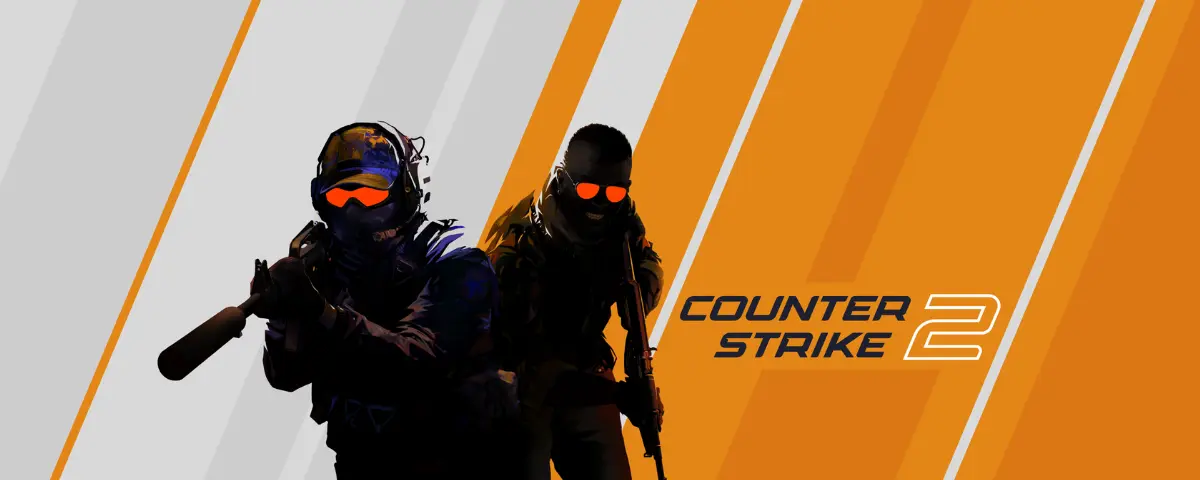
BO5 sample feature
A modern post should mix narrative and raw reference
Editorial pages work better when they switch tempo on purpose. A few paragraphs can build the central idea, but raw reference blocks let the reader validate that idea quickly. The two formats should support each other.
{
  "matchday": "spring-finals",
  "featured_series": "Falcons vs Spirit",
  "live_boards": ["matches", "odds", "tournaments"],
  "reader_jobs": [
    "understand why the story matters",
    "scan the live context fast",
    "move into deeper BO5 utility pages"
  ]
}
12:30 B8 vs FUT Esports 15:00 Falcons vs Spirit 18:30 G2 vs Vitality 22:00 Late slate recap and market review
Gallery and rhythm matter

A gallery does more than show assets. It changes the cadence of the article and gives the layout space to breathe. That matters on desktop, and it matters even more on mobile where long articles can turn into an endless stack if the rhythm is not managed carefully.
What should stay visible on smaller screens
The headline, the intro, the first actionable link, and the next useful heading should all land quickly on mobile. Readers should never need to hunt for the point of the piece or the next step.
Quick answers
What is this BO5 sample article testing?
Why include a Yoast FAQ block in the sample?
What makes an esports feature page feel modern?
Written by

Alex 'Frag' S.
4 published articles
Esports desk lead analyst covering CS2, Valorant, Dota 2, and LoL odds and draft trends.
Recommended posts

March 9, 2026
Why patch timing changes a Dota matchday
A cleaner way to read Dota slates when a fresh patch is still shaping the meta and draft priorities.
March 9, 2026
Reading live odds without chasing every swing
How to separate scoreboard noise from genuine market signals during a live match.
March 9, 2026
How veto pressure changes a CS2 semifinal
Reading a CS2 series through its veto board, pressure points, and the maps that expose structure under playoff strain.